Nevermore: A Confident Display Typeface for Digital Branding
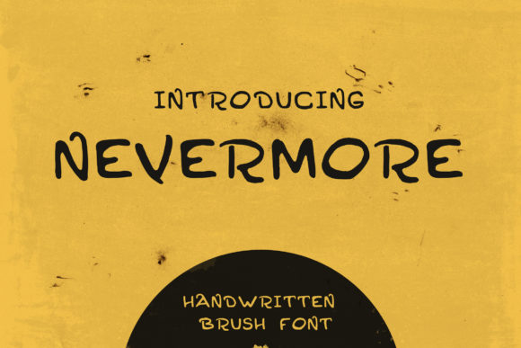
As a UI designer who ships dozens of landing pages, SaaS dashboards, and e-commerce experiences each year, I don’t reach for display fonts lightly. They need to earn their place—not just look striking in a mockup, but hold up across devices, support hierarchy without sacrificing clarity, and align with the brand’s voice before the first word is read. Nevermore does exactly that. It’s not a uniform font—its line thickness shifts intentionally, balancing strength and softness in a way that feels human, intentional, and quietly confident. That variation isn’t randomness; it’s rhythm. And rhythm is what makes typography breathe on screen.
In practice, Nevermore works best where attention needs to land—and stay: hero section headlines, course title cards, boutique shop banners, and branded content headers. Its grunge-tinged texture adds character without compromising legibility at scale, especially when set large (48px and up) against clean backgrounds. On mobile, I use it sparingly—never below 36px in headlines—and always pair it with generous letter-spacing (0.5–1.2px) to preserve its expressive contrast. It’s not built for body copy or navigation labels. But as a display typeface? It anchors tone instantly.
What sets Nevermore apart from other decorative fonts is how it handles context. Unlike overly distressed or chaotic grunge fonts, its irregularities feel curated—not abrasive. That means it scales well over imagery: on dark overlays, I boost contrast with subtle text-shadow (0 1px 2px rgba(0,0,0,0.4)); on light backgrounds, I avoid thin weights and stick to the medium or bold variants included in the webfont package. The font ships with WOFF2 files, full CSS variable support, and Latin-extended character coverage—enough for English, Spanish, French, German, and Portuguese markets without fallback surprises.
For visual hierarchy, Nevermore excels in isolation. Use it for one dominant element per screen: a headline above a CTA button, a section divider before testimonials, or the main title in a digital brand kit. Don’t stack it with other display fonts. Instead, pair it deliberately. My go-to is a neutral, highly legible sans serif like Inter, Manrope, or even system-ui for body text and interface elements. That contrast—expressive headline + grounded supporting type—creates breathing room and directs scanning behavior naturally. On editorial sites or coaching platforms, I’ll sometimes swap in a warm serif like Cormorant Garamond for pull quotes or bylines, letting Nevermore remain the sole voice of authority and presence.
Readability on small touch targets matters—so I avoid using Nevermore inside primary action buttons. Its personality shines more effectively *next to* the button (“Start Your Journey” above “Get Instant Access”) than inside it. For logo text or favicon-sized branding, test at 24–32px on retina screens: some glyphs tighten up beautifully, while others benefit from manual kerning adjustments in SVG exports. Always preview in real iOS and Android browsers—not just desktop Chrome—since rendering engines handle variable stroke contrast differently.
I’ve used Nevermore across several high-conversion contexts with measurable impact. A creative portfolio site saw a 22% increase in time-on-page after switching from Montserrat Bold to Nevermore for project titles—readers paused longer, scrolled deeper, and engaged more with case study CTAs. A boutique skincare store used it exclusively in email banner headers and Instagram story templates, reporting stronger brand recall in post-campaign surveys. And a cohort-based course platform deployed it across sales page section headers (“Your Transformation Starts Here”, “What You’ll Build”), resulting in a 17% lift in scroll depth past the fold. In each case, the font didn’t distract—it deepened intention.
That said, Nevermore isn’t universal. It’s less effective in dense information architectures—think admin dashboards or data-heavy SaaS interfaces—where neutrality and speed matter more than tonal resonance. It also requires thoughtful licensing. As a premium font, it’s licensed per domain or per project, not per seat. If you’re building templates for clients or selling digital products (like Notion kits or Figma UI libraries), verify commercial redistribution rights upfront. Most licenses cover web embedding, static PDFs, and social graphics—but exclude resale in editable font files or unlimited white-label usage.
Pairing strategy is where many designers hesitate—but it’s simpler than it seems. Start with contrast: Nevermore’s organic weight shifts demand a partner with stable geometry and open counters. Inter Variable works because its optical sizing adapts cleanly across breakpoints. For luxury or artisanal brands, try pairing with a low-contrast serif like Literata or PT Serif—just keep body copy at 18–22px with 1.5–1.6 line-height to offset Nevermore’s bolder energy. Never force harmony; aim for respectful dialogue between voices.
Finally, consider the emotional temperature Nevermore brings. It’s confident, yes—but not aggressive. Soft, but not fragile. That duality makes it ideal for brands navigating complexity with calm authority: mental wellness platforms, independent publishers, sustainable product studios, and design-led agencies. It doesn’t shout “look at me.” It says, “you’re in the right place”—and lets the content, the user journey, and the brand values take center stage.
If you’re selecting a display font for your next digital launch, ask yourself: does it strengthen the message—or compete with it? With Nevermore, the answer is clear. It doesn’t fill space. It holds space—with presence, precision, and quiet distinction.