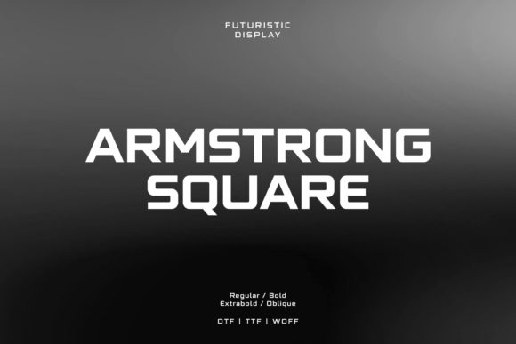
Armstrong Square: A Bold Display Font for Digital Branding
As a UI designer who ships dozens of landing pages, SaaS dashboards, and e-commerce experiences each year, I pay close attention to how typography shapes perception—before a user reads a single word. Armstrong Square stands out not because it’s loud, but because it’s intentionally decisive. It’s an all-caps display font with clean geometry, subtle rounded terminals, and just enough visual weight to command attention without sacrificing clarity. Think of it as the typographic equivalent of a well-placed accent wall: confident, modern, and instantly anchoring your layout.
In practice, Armstrong Square thrives where impact matters most—hero section headlines, product name treatments, CTA buttons on high-conversion landing pages, and banner text overlaid on hero images. Its even stroke contrast and generous x-height ensure strong legibility at scale, even against busy backgrounds or on mobile viewports. Because it’s designed as a display font—not a text face—it’s not meant for paragraphs or navigation menus. But that’s its strength: it focuses your hierarchy by making *what matters* unmistakable.
For online stores selling artisan goods, boutique apparel, or digital courses, Armstrong Square adds instant personality to shop banners and collection headers. A coaching website might use it for “Your Breakthrough Starts Here” in the hero, then pair it with a neutral sans serif like Inter or Open Sans for body copy—creating contrast that guides the eye while preserving readability. On portfolio sites, it works beautifully for project titles (“Branding Suite • 2024”) or client logos rendered in type, reinforcing brand confidence without visual noise.
Where Armstrong Square Fits in Your Layout System
Use Armstrong Square deliberately—and sparingly—to reinforce structure, not clutter it:
- Hero titles and subheads: At 48–72px on desktop (36–48px on mobile), it delivers punch without crowding.
- CTA buttons: Works best at 18–22px with tight letter-spacing; avoid using it below 16px, especially on touch targets.
- Section dividers and feature highlights: “What You’ll Learn”, “How It Works”, “Limited-Time Offer”—short phrases where tone and brevity align.
- Logo lockups and branded assets: Its consistent cap height and geometric rhythm make it highly scalable across favicons, app icons, and social profile headers.
- Digital ads and email headers: Renders crisply across platforms when served as WOFF2 and embedded via @font-face.
Avoid stretching it across full-width navigation bars or long headlines with more than six words—it’s optimized for immediacy, not endurance.
Readability & Responsiveness in Real Conditions
Armstrong Square performs reliably across devices—but only when used within its natural scope. On mobile, always test contrast ratios: it meets WCAG AA on light backgrounds at 24px+, but on dark overlays, add a subtle text shadow (text-shadow: 0 1px 2px rgba(0,0,0,0.3)) to maintain separation from image textures. For buttons, pair it with sufficient padding (minimum 12px vertical) and ensure tap targets stay ≥44×44px. Never reduce tracking below -25 unless you’re setting ultra-short labels (e.g., “BUY” or “JOIN”).
It’s also worth noting: Armstrong Square includes standard Latin character sets and basic punctuation—ideal for English-first web projects, SaaS interfaces, and marketing sites targeting North America and Western Europe. If your audience requires extended language support (e.g., Central/Eastern European diacritics or Greek), verify coverage before committing to it for global-facing templates.
Smart Pairing for Web Design Systems
No display font lives in isolation—and Armstrong Square shines brightest when paired with functional, highly readable companions. For most digital products, I default to a humanist sans serif for body text: Inter, Manrope, or IBM Plex Sans. Their open forms and low contrast balance Armstrong Square’s assertive presence without competing for attention. In editorial or luxury-focused contexts—a premium course platform or design blog—I’ll occasionally pair it with a restrained serif like Literata or Crimson Text for pull quotes or bylines, letting Armstrong Square hold the headline space alone.
Steer clear of pairing it with other bold display fonts, script fonts, or overly decorative serifs. That creates visual tension instead of harmony. And never pair it with another all-caps typeface—even a neutral one—unless you’re intentionally designing a monolithic, high-contrast identity system (e.g., for a fashion label or music festival).
Licensing & Practical Delivery
Armstrong Square is a commercial font, and its licensing matters—especially if you’re building templates for clients, launching an online store, or embedding fonts into a SaaS product. Most licenses cover web use via self-hosted @font-face or via services like Google Fonts (if available there), but check whether your plan includes unlimited domains, e-commerce usage, or template redistribution rights. For agency work, always confirm whether the license permits white-label delivery to end clients. When serving it on live sites, compress to WOFF2, define fallbacks (e.g., font-family: "Armstrong Square", -apple-system, BlinkMacSystemFont, "Segoe UI", sans-serif;), and preload critical font files to avoid flash-of-unstyled-text during load.
In short: Armstrong Square isn’t just another decorative font. It’s a strategic tool—one that sharpens focus, reinforces brand voice, and quietly elevates how users perceive your digital experience before they scroll an inch. Use it where clarity and confidence intersect. Then step back and let the type do its job.